from quarto import theme_brand_plotnine

light_theme = theme_brand_plotnine('light-brand.yml')
dark_theme = theme_brand_plotnine('dark-brand.yml')plotnine
Question
Create a violin plot of the iris data using plotnine.
Overview
We’ll create a violin plot to visualize the distribution of measurements across different iris species using the plotnine library, which implements a grammar of graphics in Python similar to R’s ggplot2.
Code and Explanation
from plotnine import *
import pandas as pd
from sklearn.datasets import load_iris

# Load the iris dataset
iris = load_iris()
iris_df = pd.DataFrame(iris.data, columns=iris.feature_names)
iris_df['species'] = pd.Categorical(iris.target_names[iris.target])

plot = (ggplot(iris_df, aes(x='species', y='sepal length (cm)', fill='species'))
    + geom_violin()
    + labs(title='Distribution of Sepal Length by Iris Species',
            x='Species',
            y='Sepal Length (cm)')
    + theme_minimal()
)

plot + light_theme
plot + dark_theme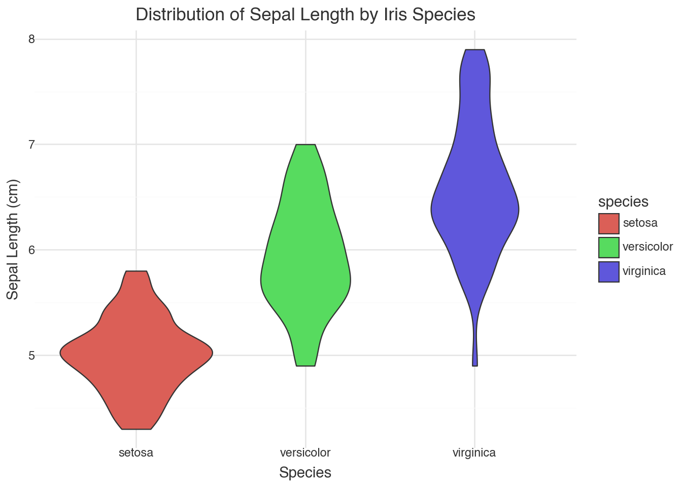
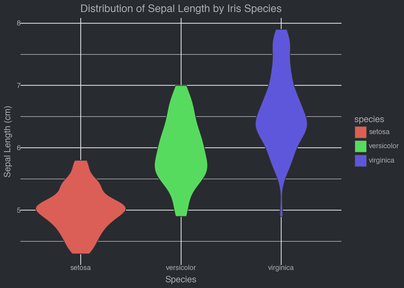
This code:
- Imports the necessary libraries
- Loads the iris dataset and converts it to a pandas DataFrame
- Creates a violin plot showing the distribution of sepal length for each iris species
- Adds appropriate labels and uses a minimal theme for clean visualization
The key correction in this version is using the proper column name ‘sepal length (cm)’ instead of ‘sepal_length’, as that’s how it’s named in the sklearn iris dataset. The violin plot combines aspects of a box plot with a density plot, showing the full distribution shape of the data. The width of each “violin” represents the density of data points at that y-value, making it easy to see where measurements are concentrated for each species.